« September 2007 | Main | November 2007 »

October 2007

October 28, 2007

Blue/Red Ocean Stock Pricing

On Friday October 26, 2007 Google's stock price (NASDAQ: GOOG) closed at $674.60, up nearly seven-fold from $100.34 at the close of trading on the first day of its IPO on August 19, 2004.  By comparison Microsoft's price (NASDAQ: MSFT) closed at $35.04, up fractionally from $27.12 during the same time span.  There were no stock splits during this period to distort the comparison. Is this just another example of irrational exuberance? Or are there fundamental differences between this blue ocean superstar and its red ocean competitor?

But wait you say. Google and Microsoft are not really competitors. Google runs a search engine and Microsoft sells packaged software. Make no mistake: the overlap in their current offerings may be slender in the competition for customers, but millions of decisions are made every day by investors about whether to buy/sell their common stocks. And it is in capital markets where the low hanging fruits of customer satisfaction are to be found.

SOME BACKGROUND
This is the 5th and final post in my series on the competition between a blue-ocean superstar (Google) and its red-ocean rival (Microsoft). This one, like the earlier posts in the series, was inspired by Blue Ocean Strategy, the book by Professors Kim and Mauborgne of the INSEAD business school in Fontainebleau, France.

In this post I forecast each company's stock price following their March quarterly reports to be filed with the SEC in late April 2008. Unlike all other stock pricing models, my competitive stock valuation prices a stock from the top down, rather than the bottom up. Introduced in Chapter 9 of my book Competing for Customers and Capital, competitive valuation assumes all ships rise and fall with the tide. So the sales revenue and market value of competitors are first combined and then parsed out according to their relative earnings productivity [REP] and risk-adjusted (value sales) differentials [RAD].

The 1st post in this series was "Microsoft's $154 Billion Question: Optimizing Red Ocean Expenses." In it I mapped enterprise marketing expenses onto the sources of intangible market value and introduced a simple measure of how shareholders know if they're are getting their money's worth on "red ocean" spending. In the 2nd post on "Microsoft vs. Google: The Battle for Your Network" I argued that however appealing blue oceans may be, nearly every company ends up in a sea of red ocean expenses. At that point the most compelling question is how to manage expenses in this environment. Theoretically, the best way to do this is to "optimize" these costs. The 3rd post in the series was "Google vs. Microsoft: Blue vs. Red Ocean Earnings Productivity." That one addressed a larger question: are there significant differences between the earnings productivity of "Blue Ocean" compared with "Red Ocean" companies? The short answer is, yes at least in the case I am currently reviewing. In the 4th post on "Google vs. Microsoft: Crossing the Blue-Ocean, Red-Ocean Divide" I pulled back the curtain to reveal the often subtle and complex relationships between the sales revenue and market value of competitors.

GOOGLE'S BLUE OCEAN TACK
Of the many points on an investor's compass only one directs a company on a blue ocean tack: it points to the northeast. This is the only direction in which both relative earnings productivity and risk-adjusted differentials increase simultaneously. Since its IPO Google has become a textbook case in northeast blue ocean tacking. This chart documents that classic pattern.

Goog_rad_rep_q205_q307_p01_2

The blue markers in this chart reveal a pattern that is exactly like a sailing ship tacking toward a northeast destination against a strong, variable wind. The red and green dotted lines create an envelope defined by the limits of Google's westward and eastward tacks respectively. By projecting these coordinates into future quarters we define the company's worst (+3.0) and best (+5.5) case risk-adjusted differentials. The dotted blue line defines the expected case (+4.3) as the midpoint between the worst and best cases.

GOOGLE'S SHARE PRICE IN APRIL 2008
If Google management continues to maximize earnings in its competition with Microsoft it should capture 26.9% of revenues by the end of March 2008. In this event investor's would likely bid up its share of market value to 45%. Currently with a risk-adjusted differential of 4.3 and an enterprise risk of 4.3 Google's forecast market value is $254.7 billion. The same values of RAD and enterprise marketing risk in the expected (blue) case are entirely coincidental.

Goog_share_price_q205_q307_p01

If the number of shares outstanding is unchanged Google's share price under the expected scenario should hit $821 in late April 2008. The worst (red) case and best (green) case prices, as defined by the risk-adjusted differentials in the chart above, are $723 and $919 respectively.

In two earlier posts I explained in detail how the competitive stock pricing model works. See "Exchange Wars: A Mexican Standoff? " and "Is Competition a New Risk Factor in Morgan Stanley's World?"

MICROSOFT'S RED OCEAN DRIFT
The way Microsoft management navigated its red ocean is more like an aimless drift than a purposeful tack. The next chart shows the pattern of coordinates in Microsoft's relative earnings productivity and risk-adjusted differentials over the same ten quarters.

Msft_rad_rep_chart_q205_q307_p01

This chart shows there is a random drift toward the northwest. Revealing that investors don't like what they see. Even though there has been a marked overall improvement in relative earnings productivity, there is no positive direction along the coordinates in this chart.

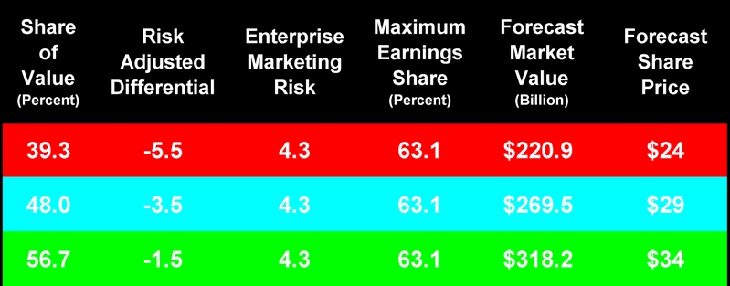
Faced with this pattern, the best way to forecast MSFT's risk-adjusted differentials is to set 95% confidence limits. Fortunately, this is easy to do. RAD is a standard normal variable (mean zero and standard deviation one). So taking the last observation as the expected value (-3.5), the lower and upper confidence limits become -5.5 and -1.5 respectively.

MICROSOFT'S SHARE PRICE APRIL 2008
A fundamental assumption of my competitive stock pricing model is that the management of a company will maximize earnings over the intervening periods. Microsoft's quarterly sales revenues jumped by over 27% in September 2007 compared with 2006. Yet, over the same period its share of combined revenues fell 3.6 share points from 80.1% to 76.5%. Even so, the company is far from the ideal of maximizing earnings: the following table pegs maximum earnings market share at 63.1%.

Msft_share_price_q205_q307_p01

There is no way management would entertain the significant loss in revenues associated with a 13.4 point drop in market share ... just to maximize earnings. That's why the forecast share price here is contained within the five year range of low and high market prices (about $24 to $34). And at a steady loss 3.6 share points per year it will take around three years for Microsoft to be driven to maximize earnings as a result of Google's revenue growth. Looks like shareholders will be reading more of the same old red ocean story well into the future.

WHAT DOES THE FUTURE HOLD?
No one knows. But it's a clear possibility that either Mr. Gates and Mr. Ballmer must come up with a blue ocean strategy or continue to watch their market share fall as Google adds new sources of revenue they cannot acquire. What do you think?

Thanks for viewing.

~V

October 21, 2007

Crossing the Bule/Red Ocean Divide

Between the 1st and the 2nd calendar quarters of 2007 Google's sales (NASDAQ: GOOG) increased from $3.664 to $3.872 billion. That's nearly 6%. In the same period Microsoft's sales (NASDAQ: MSFT) decreased from $14.398 to $13.371 billion. That's a decline of over 7%. And it's the only time in the last ten quarters that MSFT experienced a March to June quarterly decline in revenues.

From March 30 to October 19, 2007 Google's market cap increased over 42% from $142.2 to $201.2 billion. In that same period Microsoft's market cap increased just a bit over 8% from $261.4 to $283.0 billion.

It's a common expectation that when one company's revenues increase at the same time as a rival's revenue declines, both stock prices will be affected. This is an expectation one could easily forget while tracking the valuation measures currently reported in popular financial services like Yahoo!. Why? Because implicitly these measures assume that companies operate in a blue ocean – that they have no competitors.

Pick any popular metrics you want, from Price/Earnings to Market Cap or Enterprise Value to Earnings. They all are completely company specific. They do not even hint at how the 6% increase in Google's revenues, coupled with the 7% decline in those of Microsoft, might affect their respective market caps in the next quarter. Why? Because we seem to think it's all a mystery. Well, it isn't a mystery any longer. In my book Competing for Customers and Capital I pull back the curtain to reveal the often subtle and complex relationships between the sales revenue and market value of competitors.

SOME BACKGROUND
This is the 4th in my series of posts on the competition between a blue-ocean superstar (Google) and its red-ocean rival (Microsoft). This one, like the earlier posts in the series, was inspired by Blue Ocean Strategy, the book by Professors Kim and Mauborgne of the INSEAD business school in Fontainebleau, France.

The 1st post in this series was "Microsoft's $154 Billion Question: Optimizing Red Ocean Expenses." In it I mapped enterprise marketing expenses onto the sources of intangible market value and introduced a simple measure of how shareholders know if they're are getting their money's worth from "red ocean" spending. In the 2nd post on "Microsoft vs. Google: The Battle for Your Network" I argued that however appealing blue oceans may be, nearly every company ends up in a sea of red ocean expenses. At that point the most compelling question is how to manage expenses in this environment. Theoretically, the best way to do this is to "optimize" these costs. The 3rd post in the series was "Google vs. Microsoft: Blue vs. Red Ocean Earnings Productivity." That one addressed a larger question: are there significant differences between the earnings productivity of "Blue Ocean" compared with "Red Ocean" companies? The short answer is, yes at least in the case I am currently reviewing.

A SURPRISINGLY SIMPLE TRANSFORMATION
Here is a surprisingly simple transformation of commonplace financial accounting data into a metric that captures the competitive interactions between the separate, but equally important, markets for customers and capital. I call it the risk-adjusted (value-sales) differential: RAD (with a short "A"). It's what you need to cross the blue-ocean, red-ocean divide.

Goog_rad_table_q105_q207_p01

Column 1 in this table shows Google's share of value (SOV) based on the closing price of its stock at the end of each quarter from March 2005 through the close of trading on October 19, 2007. Column 2 shows the company's share of revenue (SOR) from March 2005 through June 2007. Quarterly value-sales differentials (VSD = SOV-SOR) appear in column 3. Enterprise Risk, the standard deviation in Google's VSDs, was 4.9. Risk-adjusted differentials in column 4 equal VSD/Risk. These ranged from a low of 0.5 in March 2005 to a high of 3.9 last Friday (using June 2007 revenue numbers for both companies). When Microsoft files its latest quarterly report with the SEC on October 25 I'll update the revenue numbers for both companies.

CROSSING THE DIVIDE
From a technical point of view, applying the RAD metric to a company produces a standard normal variable (mean zero and standard deviation one). Practically speaking, RAD captures the competitive interactions between sales revenue and market value. 

In the following chart risk-adjusted differentials are on the vertical axis ranging from +5 to -5. The 95% confidence limits within this range are marked by the dotted lines at +2 and -2 RADs. Ten quarters, marked by their month's end, appear on the horizontal axis.

With only two companies, risk-adjusted differentials always will be mirror images of each other. Notice that with the exception of March 2005, all of Google's differentials are greater than +2.0, meaning they are statistically significant at a 95% confidence level. Besides the March quarter all of Microsoft's differentials are less than -2.0 at the same confidence level.

Goog_msft_rad_q105_q207_p01

The meaning of this chart is simple, yet powerful. In the last nine of the ten quarters since Google went public investors rewarded management with a significant value premium over and above its market power – the company captured only 22% of combined revenues, but created 42% of combined value. Of course, it follows that investors punished Microsoft by discounting its value relative to its market power. The company captured 78% of sales revenues, but created only 58% of shareholder value. In the long run, this is how free markets deal with monopolists.

ON THE OTHER SIDE OF THE DIVIDE
The best part of this story is what you see on the other side of the blue-ocean, red-ocean divide ... when both capital and customer markets are firing on all twelve cylinders.

The two axes on the following chart combine Google's earnings productivity (from my last post) with its risk-adjusted differentials. Risk-adjusted differentials [RAD] are calibrated on the left-hand blue axis from 0.0 to +4.5. Relative earnings productivity [REP with a short "E"] is calibrated on the right-hand green axis from 0% to -35%. REP is the ratio of actual to maximum potential earnings scaled to equal zero when they are equal.

Goog_rad_rep_chart_q105_q207_p01

In the 1st quarter of 2005 Google's actual earnings [EBITDA] fell short of its theoretical maximum by 31%. Theoretical maximum earnings are the point at which outgoing costs equal incoming profits, at the margin. Over the next nine quarters Google management guided the company systematically in the direction of greater relative earnings productivity. By June of 2007 the difference between actual and maximum earnings was just 2%. Over the same period Google's risk-adjusted differential increased more or less systematically from +0.5 to +3.9 points. The correlation between the two is +0.81.

By now you may be wondering what Microsoft looks like on the other side of the divide. The next chart tells its story using the same language. And it's not a pretty picture.

Msft_rad_rep_chart_q105_q207_p01

Microsoft's risk-adjusted differentials are the mirror image of Google's. But the company's relative earnings productivity is dramatically different. In March 2005 Microsoft's actual earnings after all expenses fell 42% short of its theoretical maximum. And the pattern didn't improve much over the next nine quarters. Microsoft's relative earnings productivity followed a zigzag path reaching a high of -18% in March 2007 and closing the last quarter at -36%. The correlation between Microsoft's risk-adjusted differentials and relative earnings productivity is -0.21. Beginning in March 2006 the two more or less move in step.

WHY DO THESE METRICS MOVE TOGETHER?
My RAD and REP metrics are not currently used by investors to value a company's stock. So why do they move together? Can it be that theses metrics capture underlying, but otherwise unobservable and mysterious, market behavior? Or is it simply that Google, on the blue-ocean side of the divide in this market, is in the driver's seat? Motivating investors' performance expectations on revenues, earnings and market value to follow its lead in the competition with Microsoft, on the red-ocean side of the divide?

Whatever the reasons, I believe these metrics pull back the curtain on market mysteries enough to consult them in forecasting stock prices. To find out how to do just that, stay tuned to this station. Next week, after Microsoft releases its September quarterly report (providing a full deck of fresh, concurrent information on both companies) I'll forecast their closing stock prices on Monday December 31, 2008.

Thanks for viewing.

~V

October 14, 2007

Blue vs. Red Ocean Earnings Productivity

Google's stock price (NASDAQ: GOOG) closed on Friday October 12, 2007 at $637.39. This number brought the soothsayers out in force. In Saturdays New York Times Steve Lohr reported a sampling of views about what might bring Google's price down. Most were based on pure speculation. But one comment not only cuts to the heart of the matter, it also reminds us of the gold standard by which spending should be judged:

The biggest challenge to Google’s stock is going to be if it gets the rap of being an overspender and not rewarding shareholders fully,” said Scott Cleland, an analyst at the Precursor Group.

What's the gold standard on spending? In a word, optimize expenses. Or, spend up to the point that the cost of the last expense equals the returns to it.

Not surprisingly, Google didn't optimize its total operating expenses over the last ten quarters. However, it is a surprise to find the company actually under-spent by just over half a billion dollars in the quarter ended June 30, 2007.

This is the second in a series of posts investigating The Battle for Your Network. This one addresses another important question: are there significant differences between the earnings productivity of "Blue Ocean" compared with "Red Ocean" companies. This line of thinking, of course, was inspired by Blue Ocean Strategy, the book by Professors Kim and Mauborgne of INSEAD.

THE COST PER DOLLAR SALES
If you look at spending in the conventional way, standardized as the cost per dollar of revenues, underlying patters of over and under spending sometimes are hidden from view. This chart shows the total operating cost per dollar of revenues for Microsoft (NASDAQ: MSFT) and Google from the 1st quarter of 2005 through the 2nd quarter of 2007.

Goog_msft_cpd_33105_to_63007_p01

In the most recent quarter MSFT and GOOG spent the same amount to generate a dollar of sales revenue. That $0.65 includes all operating expenses: the costs of goods and services sold, plus selling and marketing expenses, research and development expenses as well as general and administrative expenses. In the previous quarter MSFT spent more ($0.71 vs. $0.66).  But in September, 2006 GOOG spent more ($0.70 vs. $0.61). You can see in the chart above that their spending patterns sea-saw back and forth over the ten quarters. Somehow the "Blue Ocean" effects you might expect don't appear in these numbers. Quite so, because sometimes these effects appear only when you compare each company's optimal with its actual spending.

SPENDING'S GOLDEN RULE
Spending's golden rule is to shell out money up to the point that earnings from the last dollar after all operating expenses are greater than at any other expense level. Or, what goes out equals what comes in, at the margin.

If you apply this golden rule to Google, management actually under-spent in each of the last ten quarters. The horizontal axis in the following chart is a quarterly time series. The vertical axis is Google's total operating expense: the green schedule tracks optimal spending, the yellow one is actual spending, both in billions.

Goog_optimal_spending_10_qts_ending

Over the ten quarters Google's pattern of under-spending decreased. In March, 2005 the difference between optimal and actual spending was $1.2 billion. By March, 2006 the difference fell to about $1.0 billion. It hovered around that level till June, 2007 when it fell to just over half a billion.

THE GOLDEN RULE AND GOOGLE'S EARNINGS
The impact of optimizing expenses is shown more dramatically by comparing Google's theoretical maximization earnings with its actual earnings before interest, taxes, depreciation and amortization [EBITDA]. This chart tracks the results. Again, quarterly time series is on the horizontal axis. But here EBITDA is on the vertical axis.

Goog_ebitda_q105_q207_p01

In March, 2005 the difference between Google's maximum and actual earnings was $200 million, or 32% of actual earnings. By June, 2007 that difference dropped to just $21 million, about 2% of actual. If management stays on this trajectory it looks as if over-spending will not be a problem.

RELATIVE EARNINGS PRODUCTIVITY
There's a simple way to wrap all this information up in a single metric that provides helpful guidance to investors. I call this measure Relative Earnings Productivity [REP]. Why do we need another measure of market performance? Consider what Al Rappaport says in the second edition of his classic 1986 book Creating Shareholder Value:

It is … productivity that the stock market reacts to when pricing a company’s shares.  Embedded in all shares is an implied long-term forecast about a company’s productivity – that is, its ability to create value in excess of the cost of producing it.  When the stock market prices a company’s shares according to a belief that the company will be able to create value over the long term, it is attributing [this belief] to the company’s long-term productivity or, equivalently, a sustainable competitive advantage.  In this way, productivity is the hinge on which both competitive advantage and shareholder value hang (Rappaport 1998, 69).

Relative earnings productivity combines the concept of long-term efficiency with sustainable competitive advantage.

BLUE OCEAN vs. RED OCEAN EARNINGS PRODUCTIVITY
They say a picture is worth a thousand words. Well, for investors this chart is worth a million numbers. The quarterly time series reads across the top axis from May, 2005 through June, 2007. The vertical axis reads off relative earnings productivity.

Goog_msft_rep_q105_q207_p01

Relative earnings productivity equals the ratio of actual to maximum earnings added to -1 (see the equation at the bottom left of this chart).  Why scale REP in this odd way? In order to depict a range from zero, where actual and maximum earnings are equal, to a very large negative number where actual earnings are far less than maximum earnings. The last observation in Google's REP schedule sends a clear message to investors. In the ten quarters following its IPO, Google management systematically guided the company to the point of nearly optimizing total operating expenses by the close of the 2nd quarter of 2007.

SHOULD THIS METRIC MATTER TO INVESTORS?
It's dramatically clear that, at least in this instance, when you can catch a blue ocean competitor in the act of competing with its red ocean counterpart the difference in earnings productivity can be quite significant. The theory, developed in my book Competing for Customers and Capital, shows why relative earnings productivity is one of two key metrics in competitive stock valuation. What do you you think? Should this metric matters to investors?

~V

October 07, 2007

The New Battle for Your Desktop

If Microsoft (NASDAQ: MSFT) had optimized expenses in the quarter ended June 30, 2007 the company would have earned $6.3 billion. Its actual earnings were $4.0 billion. Management threw $2.3 billion down the drain by over spending on everything in its competition with Google (NYSE: GOOG). In their book Blue Ocean Strategy, Professors Kim and Mauborgne of INSEAD don't tell us what Microsoft might do for a second act. That's because Microsoft may have been born in a blue ocean, but now the company is living in a red one.

According to the latest Interbrand report puclished in Business Week Microsoft is the second most valuable brand on the planet. Google, incorporated in 1998, is number 20 on the list. Both of these companies were born in a "blue ocean" of their own creation. But today Microsoft, at 32 years old,  already is long in the tooth for an IT company. Management now must survive in a sea of "Red Ocean" expenses. Hounded on all sides by Google as well as newer upstarts.  However appealing blue oceans may be, nearly every company ends up in a sea of red ocean expenses. At that point the most compelling question is how to manage expenses in this environment. Theoretically, the best way to do that is to "optimize" these costs. This is the 8th in my series of posts on corporate brands in enterprise marketing.

THE OLD BATTLE FOR YOUR DESKTOP
IBM (NYSE: IBM), founded in 1898 as the Tabulating Machine Company, today is the third most valuable brand in the world. This makes it easy to forget that the company drifted into a sea of "red ocean" expenses by the early 1990s. 

IBM dominated the world market in computers. Its sales revenues in 1991 were $64.8 billion. In that year IBM captured 76.6% of combined revenues in a strategic group with Hewlett Packard (NYSE: HPQ), Dell (NYSE: DELL) and Compaq Computer. At that time the company had a huge "red ocean" spending problem amounting to about $7 billion. Just when the company was about to be spun off into five or six independent parts Lou Gerstner came to the rescue. Under his leadership IBM's sales increased to $88.4 billion in 2000. But its share of revenues in the same group fell dramatically to 41.9%.

How did Mr. Gerstner solve the problem? He and his management team increased the marginal earnings delivered by each 1/100th of a market share point and decreased its marginal cost until the two were almost exactly equal. This chart tells the story.

Ibm_marginal_earnings_and_costs_910

How did they do that? You can read the details in Chapter 6 of my book Competing for Customers and Capital -- "The Battle for Your Desktop."

THE NEW BATTLE FOR YOUR NETWORK
Microsoft and Google are the leading players in the new battle for your network. This table show how they stood as of June 30, 2007. With sales of $13,371 million Microsoft dominated the market, capturing 77.5% of the combined revenues.

Msft_goog_income_statement_63007_p0

Microsoft's total costs were $9,382 million compared with Google's $2,767 millon. A closer look at these numbers, standardized as the cost per dollar of revenue, reveals an important problem: the two companies apparently applied very different financial accounting rules to their income statements.

Msft_goog_costs_q2_2007

Google reported its cost of goods and services (COGS) was $0.40 per dollar sales, while Microsoft reported it was just $0.23 per dollar sales. Meanwhile GOOG reported sales and marketing (SNM) expenses as $0.09 per dollar, while MSFT reported they were $0.23 per dollar. Looks like their financial accountants have very different definitions of these two costs. Unexplained differences like these can play havoc with optimizations. Yet, research and development (RND) costs per dollar as well as general and administrative (GNA) costs per dollar were about the same. The only way to resolve these differences, without access to their books, is to add up all the expenses and run the optimization on each company's "Total Costs."

MICROSOFT THREW $2.3 BILLION DOWN THE DRAIN
A simple static analysis will serve as a first take on Microsoft's performance. The horizontal axis of this chart is Microsoft's share of combined revenues. The vertical axis is the company's marginal earnings (green schedule) and marginal costs (red schedule) per share point. The company actually captured 77.5% of combined revenues in the quarter ended June 30, 2007.

Marginal_cost_and_earnings_q4_endin

Sometimes it's great to be the market leader. But in this case it's not. Microsoft shelled out $539 million for that 77th share point. And it was worth only $172 million after total costs. Not a good thing. To maximize earnings (by optimizing total costs) the company should have captured only 60.3% of the market. That's the point where the marginal cost and earnings per share point were exactly equal.

But, wait a minute. Microsoft management would never give up revenue to "optimize" costs. Exactly so. They wouldn't "give up revenue." But, like Lou Gerstner, Bill Gates may be forced by customers to watch their major "blue ocean" competitor add billions to revenues that remain beyond his reach. With the result of a sinking share of future revenues.

This chart shows the theoretical impact on earnings of optimizing Microsoft's total "red ocean" costs of competing with Google in 2007. The horizontal axis is share of revenues. The vertical axis is earnings before interest, taxes, depreciation and amortization.

Max_earnings_q4_ending_63007_p01

Microsoft's earnings were $3.991 billion at its actual revenue share of 77.5%. At the optimum level of competitive spending Microsoft's revenue share should be 60.3%, generating earnings of $6.271 billion. The difference is the $2.3 billion in theoretical earnings that management threw down the drain in the 2nd quarter of 2007.

IS MICROSOFT THE IBM OF THE 21st CENTURY?
We probably won't know the answer to this question for several years, if not for a decade. But the parallels are there. A brash young upstart (Google is Microsoft's Dell to IBM) steps in with a game changing "Blue Ocean" strategy. At first Google was not considered a threat. When the upstart became just that Steve Ballmer, Microsoft's CEO, called Google a "one trick pony". Sticks and stones! Is it likely that Microsoft can change its "desktop" business model to compete with Google for dominance of your network? What do you think?

Thanks for viewing.

~V